
McLaren Changed Its Logo — And the Story Behind It Goes Back to Bruce McLaren’s First Race
by AutoExpert | 27 September, 2026
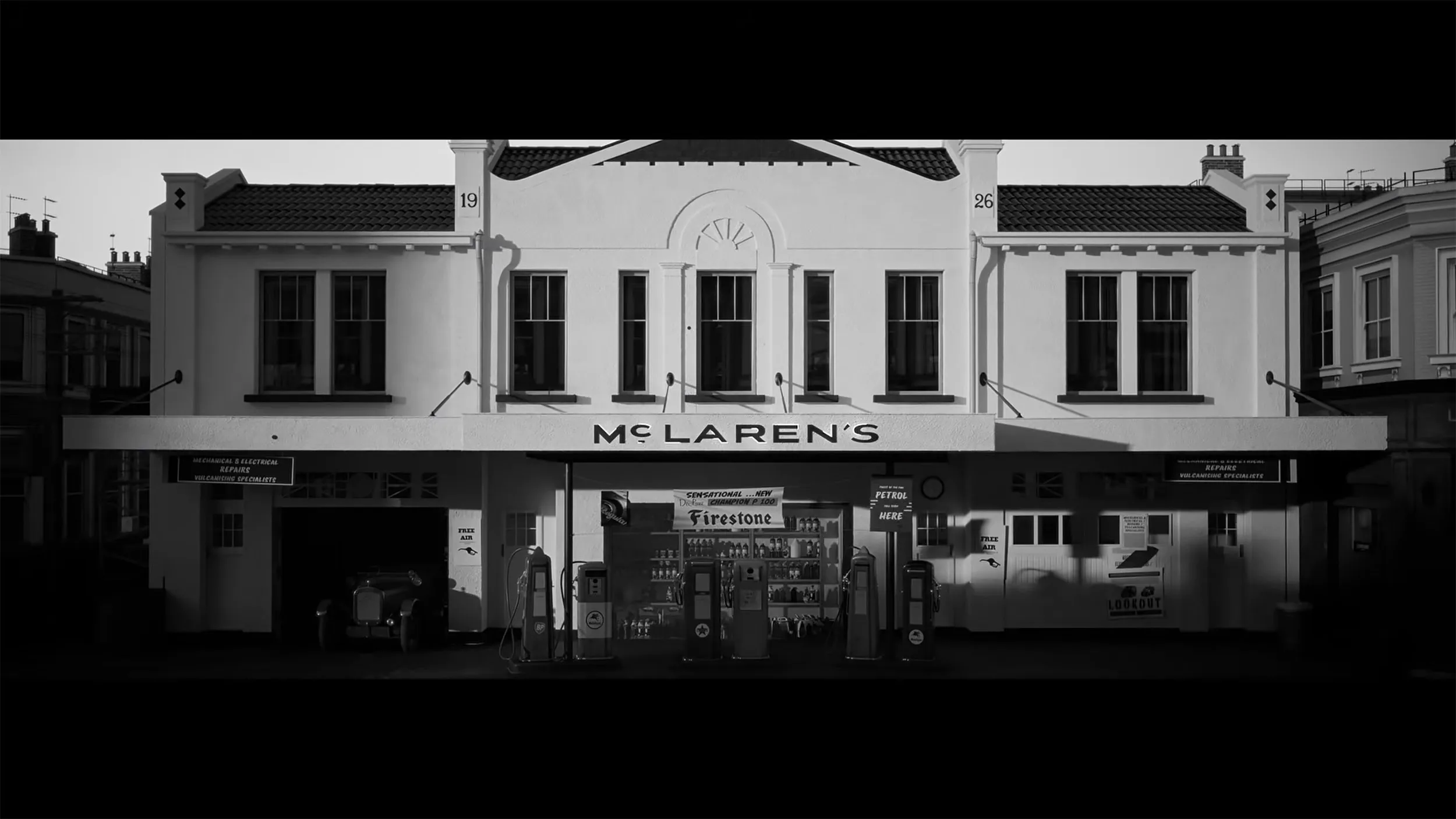
McLaren is changing its logo, but the interesting part isn’t just the logo itself. It’s where the idea comes from. The new wordmark takes inspiration from an old service station in Auckland, New Zealand, where Bruce McLaren’s parents worked and where his obsession with cars started taking shape.
That garage was more than just a family business. Bruce McLaren modified a 1929 Austin Seven there before taking it to his first race at Muriwai Beach. He won that race, and the rest, as they say, got pretty serious from there. McLaren has now taken the old garage signage and turned it into the basis for its new corporate look.
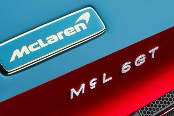
The new wordmark uses a custom typeface called McLaren Sans. The letters are all uppercase, with a horizontal line running underneath the “C.” It’s a small change, but it gives the name a noticeably different look. McLaren will start using it across future cars, merchandise, and digital platforms, with the W1 potentially being the last new model to carry the old logo on its nose.
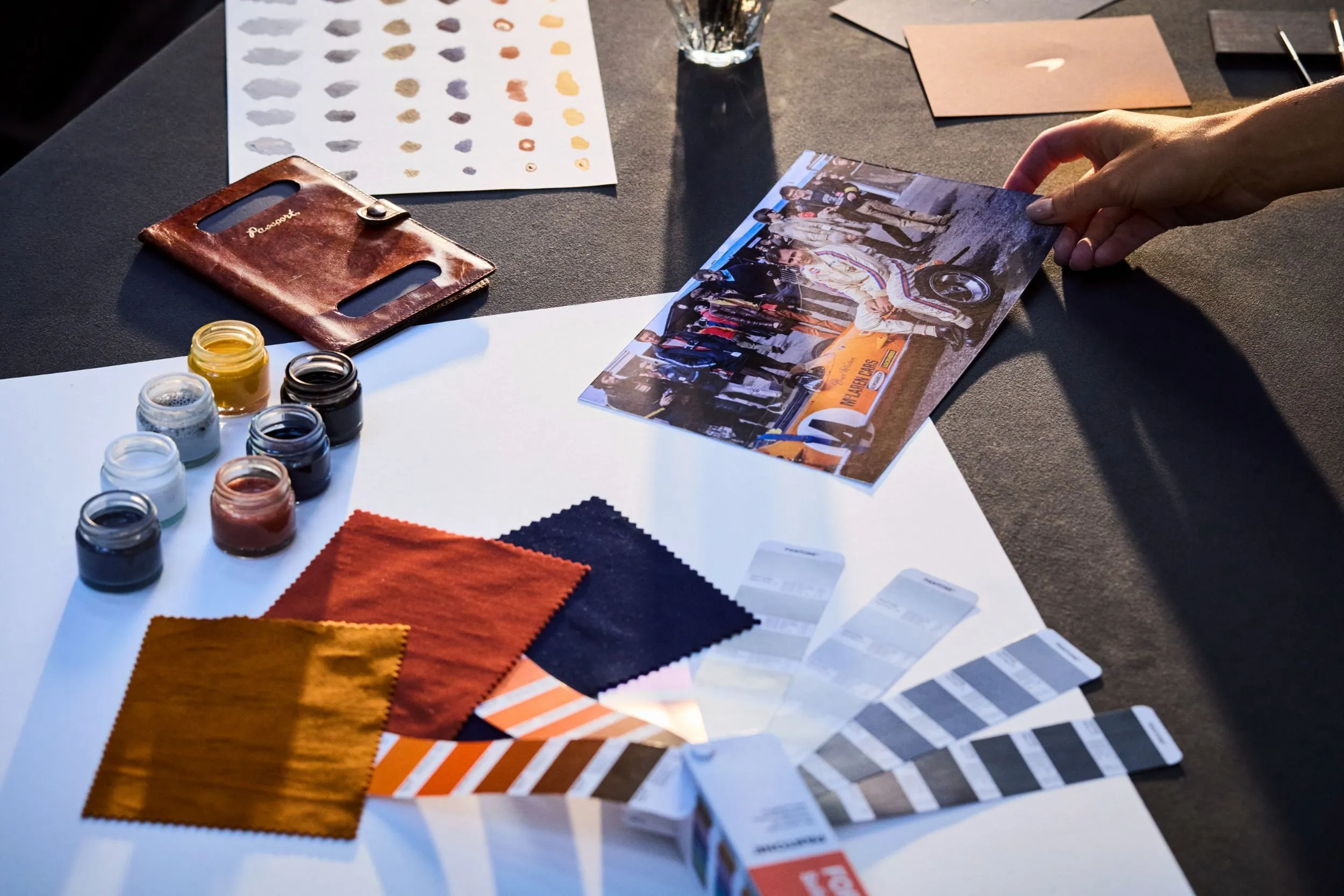
The familiar stuff isn’t going anywhere. McLaren is keeping its Speedmark and Speedy Kiwi logos, while the new color palette pulls directly from a photo of Bruce McLaren sitting on the tire of his race car. The colors include Papaya orange, Ember, Midnight blue, Black, Anthracite, Colnbrook silver, and Mist white.
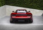
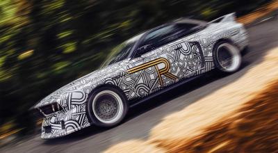
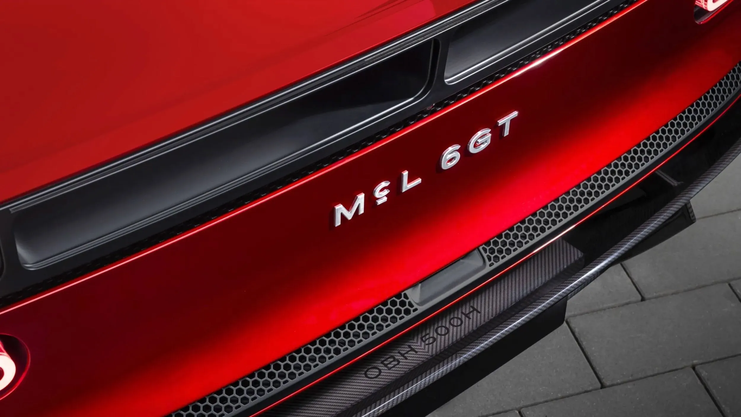
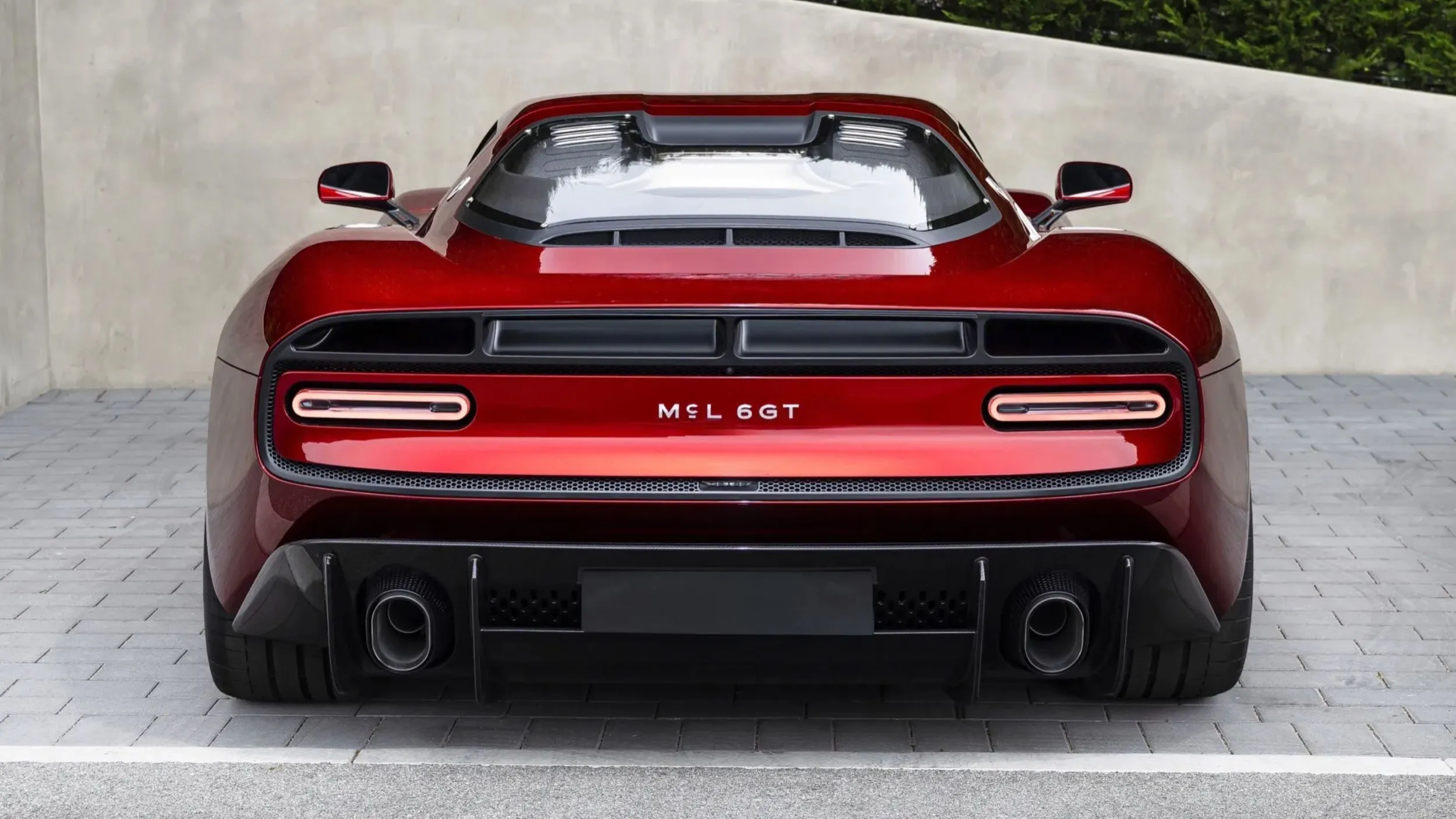
We actually got an early glimpse of the new branding on the McL 6GT at Monterey Car Week, where the new font appeared between the taillights. Now that lettering has been replaced by the full McLaren wordmark.
There’s more changing behind the badge. McLaren plans to invest £500 million ($668 million) in a second UK manufacturing site and its own engine production. The lineup is also growing, with front-engined models, two-row cars, and the company’s first SUV all planned. So while the new logo looks like a small change, McLaren clearly has quite a bit going on behind it.