McLaren Just Changed Its Logo for the First Time Since 1981 — And There’s a Story Behind It
by AutoExpert | 23 September, 2026
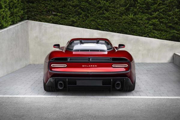
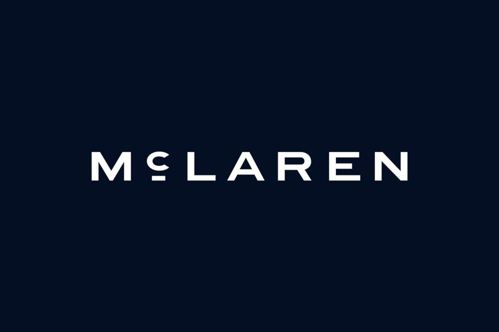
McLaren has unveiled a new logo, marking the first change to its visual identity since 1981. The new design carries a piece of the company’s early history, with its inspiration tracing back to Bruce McLaren and a gas station in New Zealand.
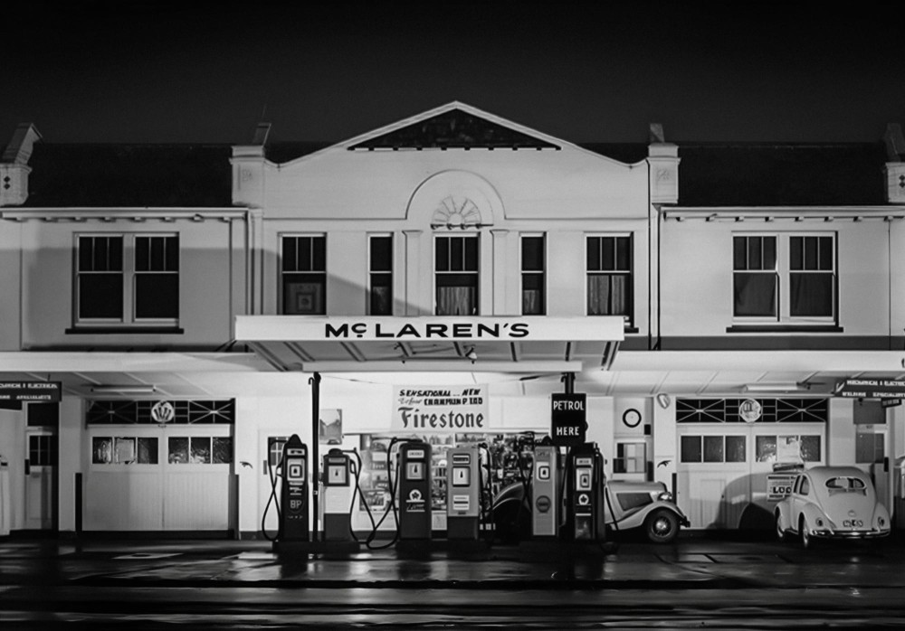
The logo draws from a design once used by Bruce McLaren’s parents at their gas station in Remuera. That location also played an important role in Bruce’s early motorsport career, serving as the place where he built his first race cars.
McLaren keeps several familiar elements as part of the new identity. The Speedmark remains, along with the Papaya color and the kiwi bird, which represents Bruce McLaren’s New Zealand heritage.
The new badge now brings that piece of McLaren history into the brand’s current identity. But what do you think: do you like the new logo, or do you prefer the old one?